
Currently Empty: 0,00 CHF


0 Comments
A chronograph born for racing makes a few demands: a wide case, pushers that stand proud, a perforated strap that recalls a pair of driving gloves. These are traits you notice on the wrist, and many people assume they sit badly under a jacket.
The most recent additions to the Chronograph collection by Cuervo y Sobrinos prove otherwise, without giving up anything of their racing character. Every code is there — colours lifted from period race posters, driving style straps, contrasting counters — yet handled with the restraint of a Maison whose reference is the Havana of the 1950s rather than pure adrenaline. The rest depends on how you wear them.

The strap sets the rule
The first thing the eye registers is not the dial: it is the strap. On the newest chronographs it is matte black calf leather, perforated along its full length, with stitching that matches the counters. On the Gran Premio de Cuba 1957 that stitching is mustard; on the Aga Blue Classic it turns burnt orange; on the Historic Endurance it stays ecru.
It is a small detail, and it governs everything else. The simplest rule, and the most reliable: the stitching is the one colour worth picking up elsewhere, and only once. A mustard knitted tie with the 1957, a ribbed ecru sock with the Historic Endurance. Echo it twice and it becomes fancy dress; echo it once and it reads as intent.
The reverse holds too. If the rest of the outfit already carries a strong colour — a green corduroy jacket, a boldly striped shirt — the perforated strap is sporting note enough. Adding more only subtracts.
A word on length, which almost nobody thinks about at the point of purchase. A badly sized strap, with the tail knocking against a shirt cuff, undoes even the most carefully considered pairing. With a folding buckle it is worth having the retailer shorten it straight away rather than putting it off: the job takes minutes and changes how the watch sits on the wrist, which in the end is the only thing that matters.
Racing colours, worn in town
The Gran Premio de Cuba trilogy takes its palette from the original posters of the three Havana races, and each edition behaves differently away from the circuit.
The 1957, vintage brown with mustard counters, is the easiest to dress: it agrees with camel, tweed and suede, with every shade autumn brings along anyway. The 1958, racing yellow with green counters, asks for the opposite — a quiet wardrobe around it, in grey, deep blue or optic white. It has already said plenty on its own. The 1960, white dial with contrasting red counters, is the most adaptable of the three: it works the way a white shirt works, which is to say almost always.
Beyond the trilogy, the Rough Riders plays on a military green dial with tone-on-tone counters and rose gold–contoured indices. It suits dark denim, aged leather and heavy cottons; far less so formal grey, which drains the warmth out of it.
September is when they work best
There is a practical reason why a brown or military green dial wears better now than it did in July. September light sits lower and warmer, and shades that looked flat in high summer become legible again. The wardrobe, meanwhile, fills up with wool, suede and heavy cotton: materials with the same slightly coarse grain as a perforated strap, which take it in without friction.
Under a linen shirt in August, a tall chronograph is mostly an obstruction. Over the sleeve of a fine-gauge jumper in September, it becomes an accent. The return to routine is also the moment when people dress with some intention again, after weeks of not thinking about it: anyone who spent the summer in a sports watch tends to notice around now that the same ease, in an office, asks for a slightly different vocabulary. The trilogy speaks it fluently, being sporting in its drawing and composed in its proportions.
| Browse the latest arrivals in the official Cuervo y Sobrinos shop and see the three editions of the trilogy. |
Gran Premio de Cuba 1958
Inspired by the legendary Havana street races of the late 1950s, the Gran Premio de Cuba Trilogy pays tribute to a unique chapter in motorsport history. Each limited-edition chronograph celebrates one of the only three races ever held—1957, 1958, and 1960—through distinctive colors, vintage racing details, and Swiss mechanical craftsmanship.
A contemporary expression of speed, elegance, and Havana’s enduring spirit.
4.800,00 CHF
Generous cases, real wrists
A few figures, kept plain. The three Gran Premio chronographs share a stainless steel case of 41 mm with a height of 15.25 mm: a measured diameter for an automatic chronograph, and a thickness you certainly feel. The Rough Riders goes up to 44 mm but down to 12.10 mm, so it covers more surface and takes up less volume.
The difference matters most under a shirt. A tall watch calls for a slightly wider cuff, or else for accepting that it will show while you drive, write or pour a drink. The stainless steel folding buckle fitted to the trilogy helps considerably: it keeps the strap under constant tension and stops the case rotating on the wrist, which on a case of this height is half the comfort.
On slimmer wrists the 41 mm of the trilogy remains the more balanced choice; on broader ones the Rough Riders finds its natural proportions.
| YOU MAY ALSO LIKE The Gran Premio de Cuba Trilogy: Three Chronographs for Three Legendary Races Heritage Chronograph: A Journey Through Time and Style |
Products by Category
-

Aga Blue Classic
4.500,00 CHF -

Emilio Carranza
4.600,00 CHF -

Gran Premio de Cuba 1957
4.800,00 CHF -

Gran Premio de Cuba 1958
4.800,00 CHF -

Gran Premio de Cuba 1960
4.800,00 CHF -
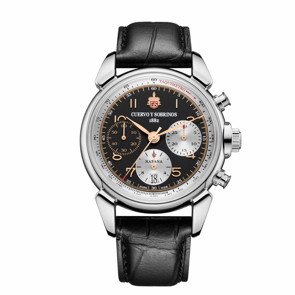
Heritage
5.300,00 CHF -
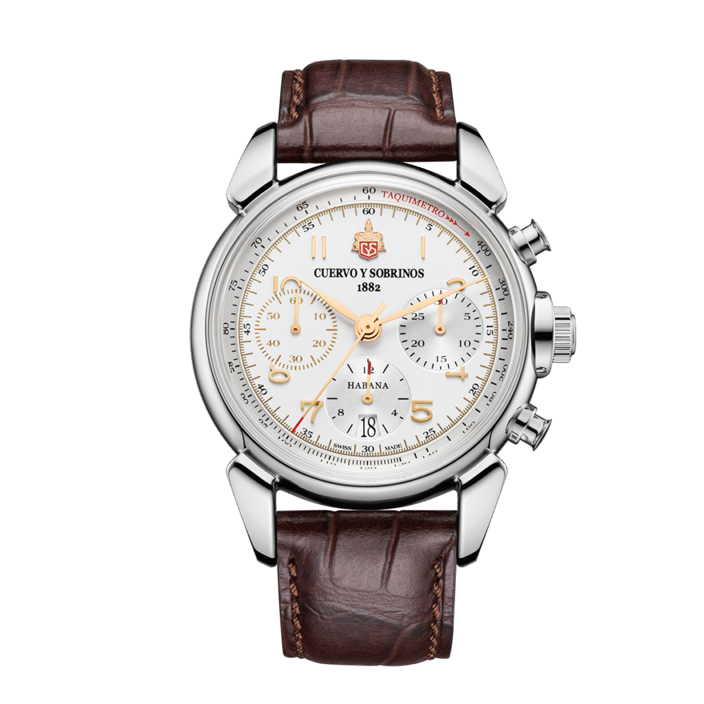
Heritage Limited Edition
5.400,00 CHF -

Historic Endurance
4.500,00 CHF -

Rough Riders
4.600,00 CHF
The weekend is the easiest ground, and for that reason the most neglected. Dark denim, a heavy cotton shirt, an unstructured jacket: this is where the Rough Riders and the 1958 come into their own, because the colour contrast finally has room to exist. The recurring mistake is stacking the references — driving strap, racer’s jacket, aviator sunglasses — until a detail turns into a declaration. One at a time is plenty.
Evenings shift the register again. When the occasion is formal, the perforated strap is the first element to jar; that is where the Chronograph Heritage in black, on matte alligator with applied rose gold indices, remains the natural alternative within the same family — the same architecture, an entirely different upbringing. When the evening is a long aperitivo or dinner among friends, the trilogy holds up perfectly well, provided the clothes do not chase the same sporting register.
There is also a middle path worth considering: the Emilio Carranza, with its black dial and vintage leather strap, keeps the sporting character on a drier note and moves from day to evening asking nothing in return.
Three pairings that survive a second look
The 1957 with a brown tweed jacket, white shirt without a tie and grey flannel trousers: the mustard of the dial and of the stitching stays the only warm note over a cool base, while the brown of the dial converses with the cloth instead of repeating it. This is the easiest of the three, and the hardest to get wrong.
The 1960 with a midnight blue suit, pale blue shirt and black shoes: the white dial acts as a point of light and the red counters only register at close range, which is the right way to use a strong colour in a formal setting. Anyone wary of a chronograph under a suit should start here.
The 1958 with a grey crew-neck jumper, navy chinos and a neutral overcoat: racing yellow performs best when everything else declines to compete. The green of the counters, which looks like a gamble at first, is what holds the combination together — a detail drawn from period sports car dashboards rather than a contemporary graphic flourish.
| Find your nearest boutique or authorised retailer and try the models on the wrist: with tall cases, judgement is only ever made in person. |
Gran Premio de Cuba 1960
4.800,00 CHF
Inspired by the legendary Havana street races of the late 1950s, the Gran Premio de Cuba Trilogy pays tribute to a unique chapter in motorsport history. Each limited-edition chronograph celebrates one of the only three races ever held—1957, 1958, and 1960—through distinctive colors, vintage racing details, and Swiss mechanical craftsmanship.
A contemporary expression of speed, elegance, and Havana’s enduring spirit.
2 in stock
The detail only the wearer sees
Every Gran Premio de Cuba carries a see-through sapphire caseback and an oscillating weight shaped like a steering wheel, with the year of the race engraved and the CyS emblem applied in 2N gold colour with red accents. Nobody else will ever notice it, and that is precisely the kind of detail on which affection for a watch is built. The Swiss savoir-faire of the Capolago atelier is measured here too, out of everyone else’s sight.
The same is true of the humidor box in which each timepiece arrives: a direct inheritance from the cigar culture of the Havana where the Maison was founded in 1882.
| YOU MAY ALSO LIKE Rough Riders: The Watch for Summer Adventurers The Charm of Vintage Watches: When Design Tells a Story |
One rule, if a rule is needed
Wearing a racing chronograph well means letting it play its part and no more than that. It supplies the colour; the wearer supplies the pace. It works when it is the only element speaking loudly, and stops working the moment it becomes a chapter of a costume.
Havana in the 1950s was never a period piece, after all: it was a city where the same person went from the circuit to the restaurant without going home to change. That is where these chronographs come from, and that is how they should be worn.
